Trust that completes
Help people understand what is happening before they commit money, identity or business information.
Paysend was not simply a payments UI problem. It was a trust-sensitive product system spanning onboarding, consumer transfers, business flows, compliance signals and the moments where customers need to know exactly what happens next.
Paysend's public proposition is simple on the surface: help people send money internationally and help businesses move money through global payment infrastructure. Underneath that sit the hard bits: currencies, accounts, cards, wallets, recipients, fees, payout methods, verification, compliance, settlement, support and failure states.
That is the useful design problem. The customer should not have to understand the payment machinery. They do, however, need to understand enough to trust it. Who am I sending to? What will it cost? When will it arrive? What happens if something needs checking? Has the money actually moved?
In fintech, friction can be dangerous to remove carelessly. Some friction is bad: repeated questions, unclear terms, hidden states, weak error messages, confusing next steps and forms that make people feel they are being tested rather than helped.
Other friction is protective. Identity checks, eligibility, compliance, confirmation, payment review and risk controls exist for good reasons. The design leadership job is not to make everything feel instant. It is to make necessary difficulty feel proportionate, explained and survivable.
Do not make money movement merely faster. Make it feel knowable.
The work was about connecting consumer and business journeys to a clearer product model: onboarding, verification, transfer state, recipient confidence, business payout logic and the standards teams used to make decisions.
That turns design from surface simplification into a commercial capability. Better clarity improves completion, reduces avoidable anxiety, gives teams a shared map and helps the business protect trust while the proposition grows.
The local evidence points to several connected streams: consumer onboarding, sign-up and login, transfers and requests, accounts and cards, transactions, new app navigation, roadmap workshops, business onboarding logic, website structure and design principles.
The interesting thread is not a single screen. It is the attempt to make a money-movement business easier to reason about. Consumer, business and enterprise capabilities cannot each invent their own logic if the company wants to scale without confusing customers or creating expensive internal inconsistency.
Onboarding is not a registration chore. It is where the product explains what it needs, why it needs it and whether the customer can safely keep going.
Remove avoidable doubt, repetition and ambiguity while preserving the checks that protect the customer, the business and the payment network.
A transfer needs clear states, plain language, reassurance and recovery paths. People need to know what has happened, what is waiting and what they can do next.
Cards, accounts, wallets, transfers, requests, business onboarding and payouts need a shared model so the offer can grow without becoming a set of disconnected flows.
Principles only matter when they help teams decide. The work was to make customer value, trust and product quality easier to challenge and repeat.
Money movement products make money when people complete important tasks with confidence, come back, and recommend the service to others. Design contributes to that by reducing uncertainty at the points where customers might abandon, contact support or lose trust.
For business and enterprise propositions, the value is also operational. A clearer product model helps teams discuss trade-offs, ship with fewer contradictions and understand where compliance, technology, customer experience and commercial priorities meet.
Help people understand what is happening before they commit money, identity or business information.
Keep transfers, accounts, cards, wallets, onboarding and business flows connected to one coherent model.
Use principles, roadmap framing and product standards so teams make better decisions without re-litigating every flow.
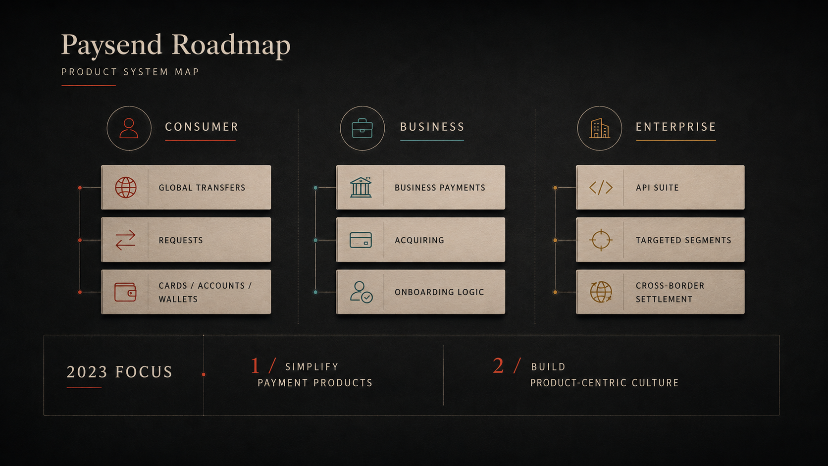
A rebuilt product-system map showing consumer, business and enterprise product areas being brought into a clearer product conversation.
The receipt is deliberately kept as supporting evidence rather than the visual face of the case. It proves the consumer, business and enterprise product conversation, while the strategic story is the system underneath it.
Good fintech design does not hide the seriousness of the category. It makes serious things easier to understand. That is where trust is earned: not through reassurance copy alone, but through product state, clear choices, useful checks and a model that lets the organisation grow without making customers carry the complexity.