Service adoption
Make operator services easier to understand at the moment they become relevant.
Orange was not just a branded UI exercise. It was a device-level product system: first-use journeys, assistant behaviour, app discovery, homescreen states and service logic that had to feel coherent across markets.
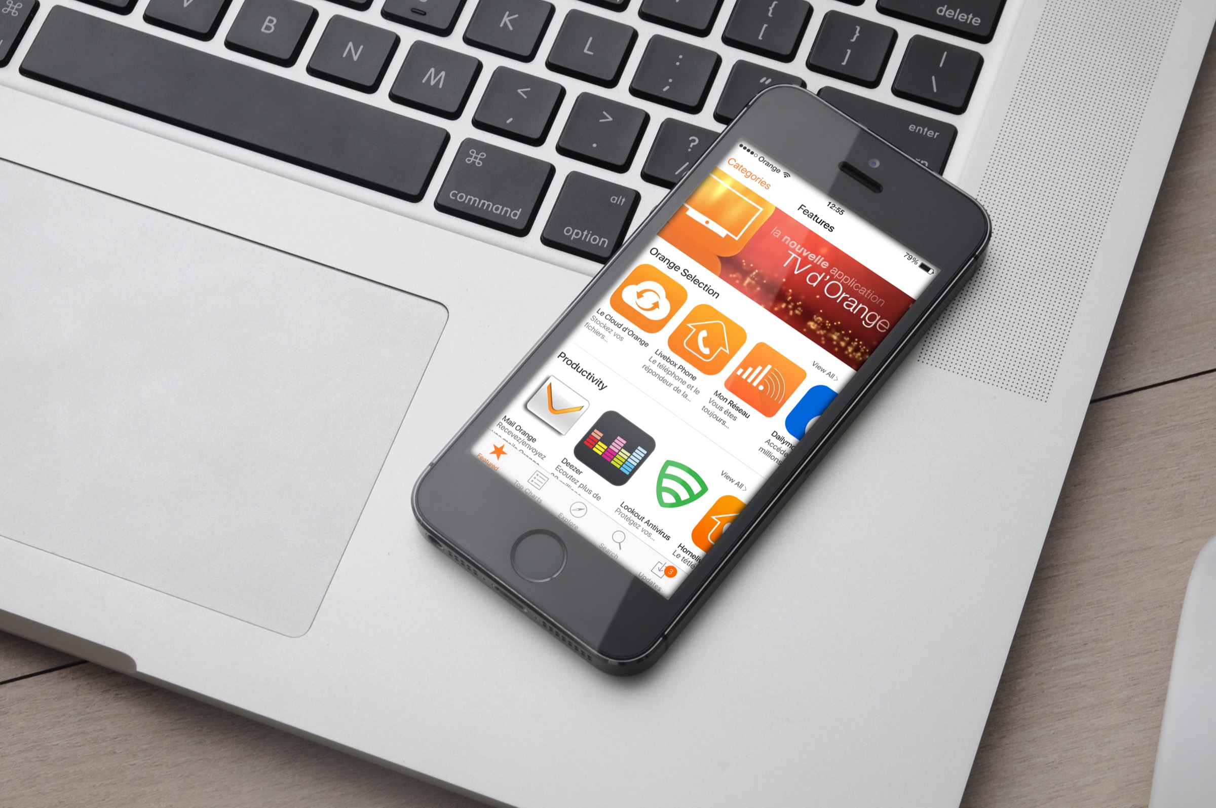
Orange branded devices required more than a set of screens. The product had to carry brand, local market needs, Android behaviours, hardware constraints, app discovery and service logic in one experience.
The work sat between interface craft and system design. A customer did not experience the organisation as separate workstreams. They experienced a phone being switched on, configured, understood, updated and used. That meant the design problem was not "make an Orange screen". It was "make the Orange layer feel useful, coherent and trustworthy without getting in the way of the phone".
A telco-branded device touches a lot of moments very quickly: language, emergency calls, setup, Google handoff, data consent, home screen, app recommendations, service discovery, help, settings, updates and support. Each of those could be treated as its own small UI problem. That is how branded device experiences become fragmented.
The stronger move is to treat them as one product system. What should the user understand first? Where does Orange add value rather than noise? Which services need introduction? Which moments should be deferred? What does the assistant know? Where does the user go when they need help?
The brand had to show up as useful structure, not decoration.
The startup journey had to connect welcome, language, setup, Google requirements and Orange-specific value without turning the first session into a sales pitch.
Orange Assistant needed to behave like a support and discovery layer: help, settings, service options, app information and search, available from the phone rather than hidden in one destination.
Apps Orange and related screens had to make operator services understandable: cloud, Livebox, network, email, TV, data control, security and other service propositions.
The maps show how individual screens became flows: first-use paths, service entry points, setup states, handoffs and returns to the home screen.
The work had to support brand consistency while allowing for different devices, local propositions, Android behaviours and delivery constraints.
For a network operator, the value of the device experience is not only visual recognition. It is whether customers understand the services available to them, use the right features, complete setup with confidence and know where to go when something needs attention.
Good design in this context can reduce avoidable confusion, make bundled services easier to discover, give markets a shared way to express the brand, and help product teams avoid rebuilding the same patterns in slightly different ways.
Make operator services easier to understand at the moment they become relevant.
Give people clearer routes to help, settings, app information and recovery.
Turn branded moments into patterns that can travel across devices, markets and teams.
Apps Orange as the visible face of the system: app discovery, operator services and branded mobile interaction.
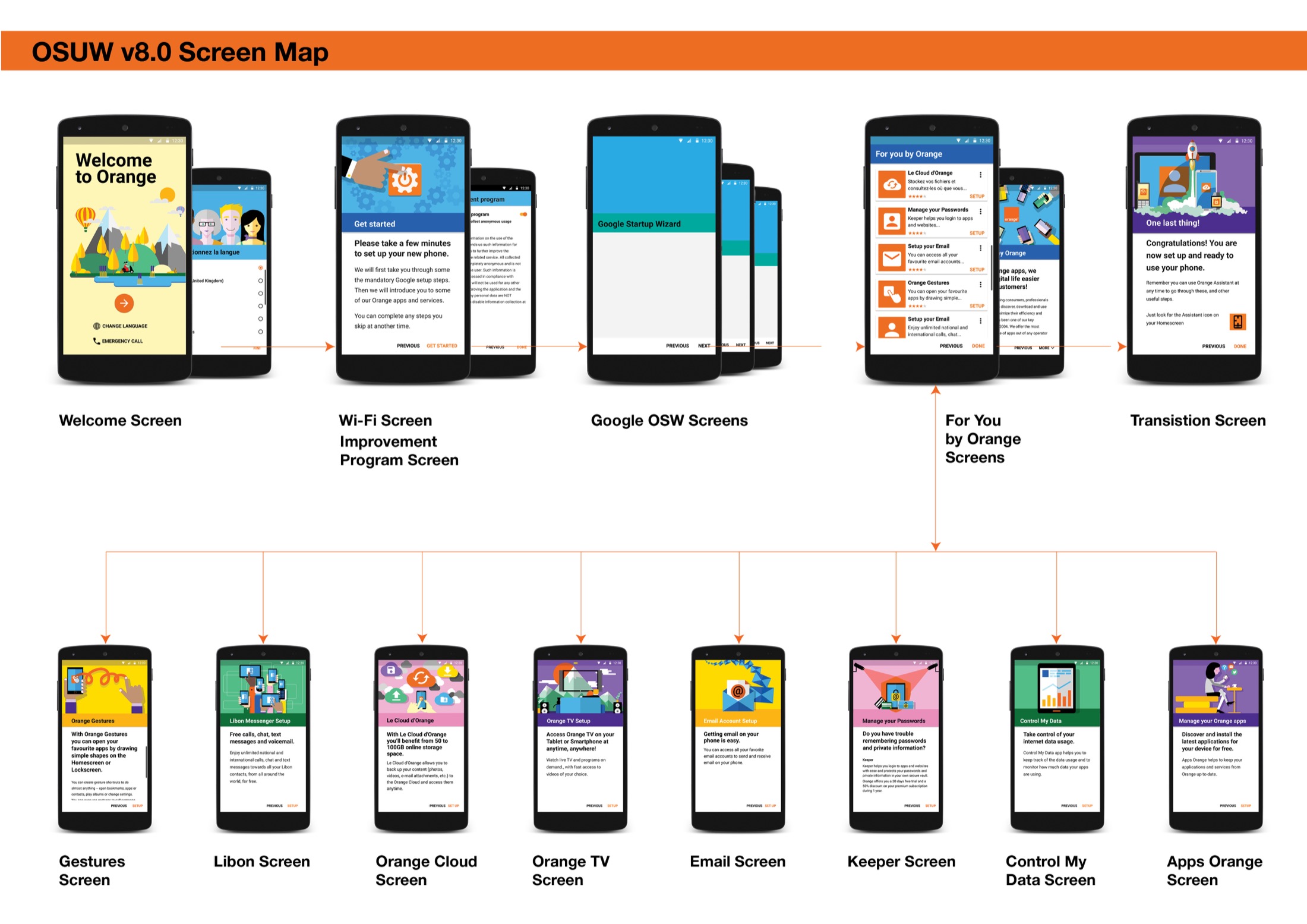
The startup wizard map showing how welcome, Google setup, Orange service introduction and post-setup states connect.
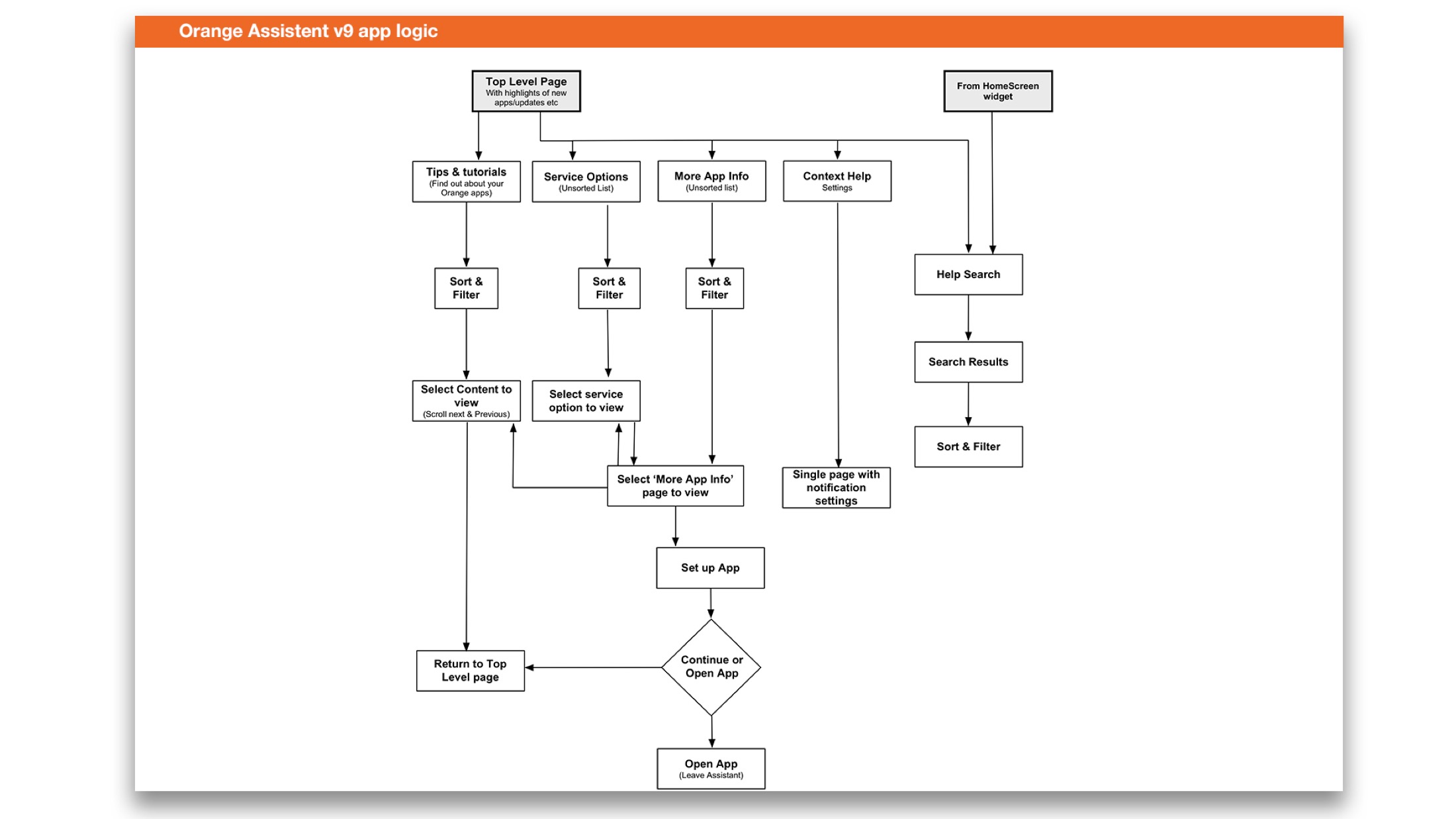
A logic map for Orange Assistant showing service options, tips, more app information, contextual help and search.
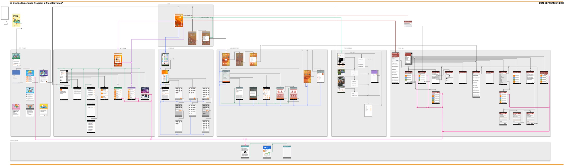
A large-scale ecosystem map connecting apps, homescreen states, startup wizard, assistant behaviour and library patterns.
Orange is useful because it shows design operating at several altitudes at once. There is interface craft in the screens, service thinking in the assistant, journey thinking in the first-use flow and system thinking in the ecosystem map.
That is the part worth carrying forward. In complex organisations, the work is rarely just the screen in front of you. It is the structure that allows many screens, services and teams to feel as if they belong to the same product.